No, gentle reader, I’m not extolling some obscure medical condition, just the new Cold Spots comic from Image Comics.
Yes, like you, I’m wondering why the creative team chose the title that they did, and the easy answer would probably be because of what the characters experience at different stages of this story. But this is the thing about comics themed on supernatural horror and disquiet. The mystery is a sizeable part of the appeal. Cullen Bunn’s writing on this debut issue is watertight and enforces my theory, when you consider how sparse the narration is. Bunn has adopted a restrained approach when it comes to dialogue, but it isn’t out of lack of ability, especially considering that he’s written Deadpool, amongst other comic book heavyweights. Cold Spots #1 has a considerable 40-plus wordless panels, which deepens the flavour of mystery throughout the pages. At the onset, we aren’t given the name of the town in which this story is set – this could be any small town that we know, and that’s precisely why this technique is storytelling gold.
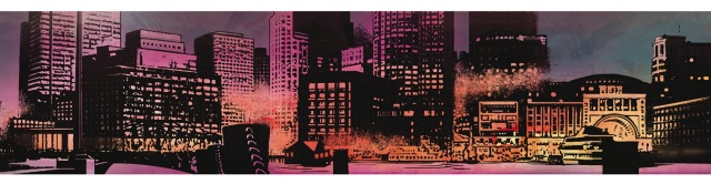
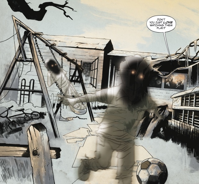
Mark Torres’ treatment of the script makes it seem like producing compelling artwork is as easy as pie, but when you slow it down, you really start to appreciate the choices he’s made when it comes to colours and shade. The artwork conveys a sense of dark foreboding in colours that would amp up the atmosphere in art noir stories, which appeals to the sense of eeriness, without going overboard. The appearance of the faceless ghost-children early on spooks beautifully, making you anticipate in horror what’s yet to come. There’s never a moment where the book feels pulpy, and the bright city hues at the start of scene 2 add a contemporary vibe to the proceedings.
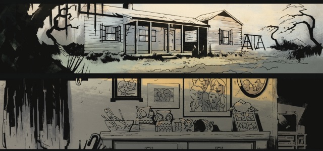
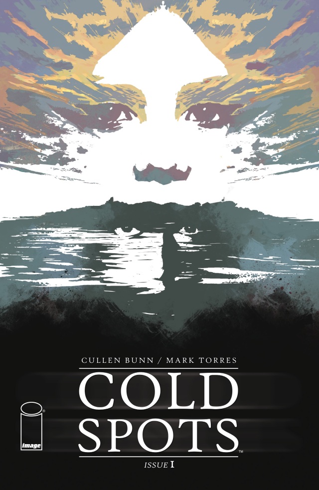
It would be an embarrassing oversight if we didn’t take a minute to admire the beauty of that cover, with the superimposed faces and contrasting bright and darker colours. If you notice, the title logo has been placed on the bottom of the page, which isn’t the most traditional placement. Does this add to the whole unsettling atmosphere of the book? You bet your stack of X-Files tapes it does! The design of page 2, meanwhile, has shared images from the cover and page 3, giving the reader a sense of welcome into the story, which is a phenomenal non-verbal narrative technique and a welcome variation to what so many comic books tend to follow.
The mystery about the creative team’s choice for the book title will be solved in upcoming issues – the debut was about setting us up for some good dark pages and reveals. All the same, there’s plenty of reasons why this is a strong debut that Bunn, Torres and Image can be proud of.
